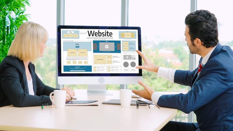
A homepage is often the first page visitors see when they arrive at a business website. Within a short amount of time, visitors begin deciding whether the business appears professional, trustworthy, and relevant to their needs. A confusing or outdated homepage can cause potential customers to leave before exploring the rest of the website.
A well-designed homepage helps guide visitors toward the information and actions that matter most. Clear messaging, intuitive navigation, strong visuals, and strategically placed calls to action can create a smoother experience and encourage more visitors to take the next step.
Why Your Homepage Matters for Conversions
The homepage serves as an introduction to the business and often connects visitors to important service, product, and contact pages. If visitors cannot quickly understand what the business offers, they may have little reason to continue exploring.
A conversion-focused homepage should answer important questions early in the visitor’s journey. Customers should be able to understand what the business does, who it serves, why it may be a good choice, and what action they can take next.
Clear Messaging Helps Visitors Understand Your Business
One of the most important elements of a homepage is its main message. Visitors should not have to search through multiple sections to understand what the company provides.
A clear headline supported by concise supporting content can communicate the business’s primary value quickly. When visitors understand the purpose of the website, they can move through the rest of the page with greater confidence.
A Strong Call to Action Guides Visitors
A homepage should make it clear what visitors should do next. Depending on the business, that action might be requesting a quote, scheduling a consultation, calling the company, making a purchase, or contacting the team.
Calls to action should be easy to identify and placed naturally throughout the page. Instead of leaving visitors wondering where to go next, a well-designed homepage provides clear paths toward conversion.
Professional Design Builds Trust
Visitors often form an impression of a business based on its website. A clean layout, consistent branding, quality images, readable typography, and organized content can make a business appear more professional.
When a website feels outdated, cluttered, or poorly maintained, visitors may hesitate to provide their information or contact the company. Professional design can therefore support the trust needed before a visitor takes an important action.
Simple Navigation Reduces Friction
Navigation should help visitors find information without making them work unnecessarily hard. Important pages such as services, about information, contact details, and other relevant resources should be easy to locate.
A simple and logical navigation structure can reduce frustration and help visitors move naturally through the website. When people can quickly find what they need, they are more likely to continue exploring.
Relevant Visuals Can Support Conversions
Images and other visual elements can help visitors understand a business and its offerings. Relevant photographs, product images, graphics, and other carefully selected visuals can make a homepage more engaging.
Visuals should support the message rather than distract from it. A strong homepage uses images to reinforce the business’s identity and help visitors understand what they can expect.
Social Proof Can Increase Customer Confidence
Visitors may feel more comfortable contacting a business when they can see evidence of positive customer experiences. Testimonials, reviews, case studies, and other forms of social proof can help demonstrate credibility.
Social proof is especially useful when placed near relevant services or calls to action. When potential customers see authentic experiences from others, they may feel more confident about taking the next step.
Mobile Design Can Affect Conversions
A large number of visitors may access a business website from smartphones. If the homepage looks good on a desktop but is difficult to use on a mobile device, potential customers may leave before completing an action.
Responsive layouts, readable text, appropriately sized buttons, simple navigation, and well-organized sections can make the mobile experience easier. A homepage should provide a consistent and usable experience across different screen sizes.
Website Speed Can Reduce Abandonment
Visitors expect websites to load quickly. When a homepage takes too long to load, people may leave before seeing the business’s message, services, or calls to action.
Optimizing images, reducing unnecessary elements, improving page structure, and addressing technical performance issues can help create a faster experience. Better performance can make it easier for visitors to engage with the website.
Organized Content Keeps Visitors Moving
A homepage should not overwhelm visitors with too much information at once. Content should be organized into clear sections that answer common questions and gradually guide visitors toward a decision.
Headings, short paragraphs, visual spacing, service summaries, testimonials, and calls to action can create a logical flow. Each section should have a purpose and contribute to the visitor’s journey.
Trust Signals Can Support Better Decisions
Visitors may look for signs that a business is legitimate before submitting a form or making contact. Contact information, certifications, guarantees, reviews, business details, and other relevant trust signals can help reduce uncertainty.
These elements should be presented clearly without making the homepage feel cluttered. The goal is to give visitors enough confidence to move forward without overwhelming them.
Forms Should Be Easy to Complete
If the homepage includes a contact or inquiry form, the form should be simple and straightforward. Asking for unnecessary information can create additional friction and discourage visitors from completing it.
Clear labels, helpful instructions, logical fields, and an obvious submission button can make the process easier. A simple form can provide a more comfortable path from website visitor to potential customer.
Every Homepage Element Should Have a Purpose
A conversion-focused homepage should be designed around the needs of the visitor and the goals of the business. Extra animations, excessive text, unnecessary pop-ups, or distracting elements can make it harder for visitors to focus on important information.
Each section should support a specific purpose, such as explaining a service, building trust, answering a question, or encouraging an action. A focused design can create a clearer path toward conversion.
Homepage Design Should Be Reviewed Regularly
Customer expectations and business goals can change over time. A homepage that worked well several years ago may no longer communicate the business effectively or provide the best user experience.
Businesses should periodically review their homepage content, calls to action, design, performance, mobile experience, and conversion paths. Small improvements can help keep the website relevant and effective without requiring a complete redesign.
Final Thoughts
A well-designed homepage can do much more than make a website look professional. It can help visitors understand a business, build confidence, find important information, and take the next step toward becoming a customer.
By combining clear messaging, strong calls to action, professional design, intuitive navigation, relevant visuals, social proof, mobile-friendly layouts, fast performance, and focused content, small businesses can create homepages that provide a better user experience while supporting stronger website conversions.